01 Context02 Overview03 Research04 Ideation05 Final Design06 Next Steps
Back

Challenges

Sunspot Natural Market faces the key challenge of attracting more customers to its store. To achieve this goal, the market is exploring various marketing strategies to promote its organic products to West Lafayette residents, as well as students and faculty at Purdue University. Additionally, the store aims to encourage more online purchases, but currently lacks an e-commerce platform for customers to browse and buy products online. Our team decided to to begin by observe and identifying the problems customers encountered, with the aim of creating an engaging experience tailored to Sunspot's target users.

What I Accomplished

  • Interview and identified key pains in the Sunspot Natural Market shopping experience.
  • Design app interfaces for customers to purchase products online.
  • Design and implemented a streamlined comparison page for effortless product selection.

My Role

UX Designer — Interaction Design, Visual Design, User Flows, App Design

Team

Sylvia Tsai, UX Designer & Researcher

Shankun Zhou, UX Designer

Siying Wang, UX Researcher

Timeline

Oct - Nov, 2023 (4 weeks)

01 Research

What is Sunspot Natural Market?

Founded in 1977 by Joan M. Johnson, Sunspot Natural Market is a locally-owned grocery store with two locations in Indiana, one in Kokomo and the other in West Lafayette. Specializing in natural and organic products, including nutrition and supplements, Sunspot Natural Market is dedicated to improving community wellness. Their mission is to provide the highest quality goods, a diverse selection, and educational resources, all delivered with exceptional personal service. This project specifically addresses challenges faced by the West Lafayette store, situated near Purdue University.

Observation

We conducted two observations at Sunspot Natural Market to identify challenges encountered by customers and enhance their shopping experience. In our initial observation, we observed that the store primarily emphasizes healthcare products and offers nutrition consulting services to aid customers. They also feature their own line of healthcare products and package local groceries with consistent labeling. However, the selection of fresh products is relatively limited compared to other stores. New customers often struggle to locate items due to unclear labeling and typically refrain from seeking assistance from staff. The lack of clear product labeling presents challenges for customers.
During our second observation, we discovered that the store's staff possesses extensive knowledge about their products, understanding their unique selling points even if these are not explicitly stated on packaging. Customers frequently seek their consultation, particularly during busy periods when staff may become overwhelmed. New customers typically prefer to explore the store independently. Most customers demonstrate distinct preferences, such as favoring more affordable products, brand loyalty, or having specific ingredient sensitivities. Some seek supplements to alleviate particular symptoms. Customers often compare products from various brands within the same category, but the diverse packaging makes it challenging to locate similar information. As a result, they often turn to store clerks for assistance in analyzing product differences based on their individual needs.
The image displays multiple identical products within the same category, posing a challenge for customers when making a selection.

Interview

We conducted interviews with four individuals: a regular customer of Sunspot Natural Market, two new customers—one younger and one elder—and the manager of the market. The purpose of these interviews was to identify challenges they encountered regarding the current grocery store and the overall user experience of shopping there. By gathering insights from both customers and the manager, I aimed to gain a comprehensive understanding of the issues that should be addressed in the design process.
1| Nutrition & Supplements
Upon observing the store and reviewing the interview findings, we observed that the store primarily emphasizes the sale of nutrition and supplements rather than fresh foods. Consequently, our project will center on improving the problems that encountered in nutrition and supplements section.
2| Staff Suggestions
It's evident that many customers depend on the recommendations and suggestions provided by the staff when selecting products. Given the abundance of similar products in the store, the guidance from staff members is crucial for customers in making their purchasing decisions.
3| Online Platform
Prior to our visit to the store, we discovered that they lacked an online platform for customers to make purchases through their website. Following our interview with the store manager, we learned of their interest in developing a website to facilitate online purchases as part of their efforts to promote and market the store.
4| Lack of Labeling
Through our observations and interviews, we discovered that the store lacks adequate labeling for customers to navigate efficiently. New customers often find themselves needing to traverse the entire store to locate desired items. We aim to address this issue to enhance the overall shopping experience for customers.

02 Ideation

Scenario

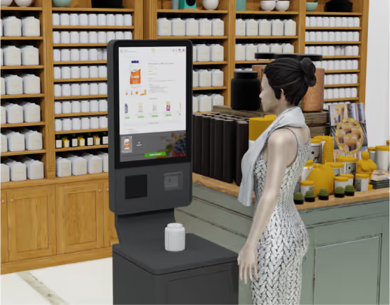
This scenario outlines the user experience of utilizing the kiosk to search for and compare products.
We've chosen to install a kiosk within the store, providing customers with the ability to compare supplements and nutrition products independently, especially when they prefer not to seek assistance from store staff. The kiosk's primary features allow customers to search for desired products through queries or scans, enabling them to access specific product details. Customers can delve deeper into product information, including ingredients and key features, while benefiting from a larger screen that presents comprehensive information about the available products in the store.

User Journey Map

The user journey shows the path a users follow as users go through the Sunspot Kiosk and App.

Low-Fidelity Sketches

During the sketching process, we identified key functions essential for the kiosk experience. For instance, we examined different methods for facilitating supplement comparison based on ingredients and functionality, rather than solely focusing on brand. Additionally, we brainstormed various options for integrating robust search capabilities and a "keyword" feature to highlight additional product details not evident on the packaging.
Feedback received on the initial sketches emphasized the importance of establishing clear information architecture and navigation as fundamental aspects. Moreover, the sketches helped clarify which features to prioritize during development, notably supplement comparisons and keyword searches.
The low-fidelity sketches primarily concentrate on brainstorming the features intended for inclusion in both the kiosk interface and the app. Our emphasis is to introduce the comparison feature and enhancing search efficiency for users.

Usability Testing

1| User-Friendly Navigation Menu

A user-friendly navigation menu stands out as a notable improvement. Users appreciate its clear categories for health supplements, making it easier to find products quickly. The navigation menu also improve the overall user experience.

2| Accessibility Features for Elderly Users

Design emphasizes accessibility, especially for elderly users. Larger fonts and redesigned icons cater to potential visual impairments, making interactions more intuitive and enhancing usability.

3| Successful Products Comparison Page

Users have praised the comparison page for its effectiveness in aiding customers to make informed product selections. They appreciate the ability to effortlessly add and remove products for comparison, facilitating the selection of desired items. The layout of the screen is intuitive, making it easy for users to comprehend.

4| Personalized Recommendations

The personalized recommendation feature in the prototype has been praised by users for its ability to offer tailored product suggestions based on preferences. It simplifies decision-making and enhances the shopping experience, fostering increased satisfaction and loyalty.

03 Final Design

Kiosk Interface Design

We aim to develop a kiosk for Sunspot Natural Market customers to efficiently locate products, given the absence of labels in the store, and to conduct product comparisons without requiring assistance from staff. This kiosk will enable new customers to swiftly find their desired items independently. Currently, we are narrowing down the focus of our project to concentrate on the supplements and nutrition products available in the store, as the store predominantly emphasizes nutrition-related items.

Kiosk Product List Page

The list page has detailed filters on the left side, where users can set different categories according to their preferences. If users do not wish to display this part of the filter, they can click the minus sign on the right side to hide it. Additionally, a breadcrumbs filter is provided to facilitate easy navigation across the entire interface. At the same time, each product card also displays the product's price and location, helping users quickly find products in the store. At the bottom of the page is the position of the comparison box, where users can choose the product images they wish to compare from the list page to add them to the comparison list.

Kiosk Comparison Page

Our survey findings highlighted that some users expressed a desire for more thorough comparisons of product ingredients and nutritional information tables. This need arises particularly from individuals with allergies to specific ingredients who must carefully scrutinize product details. However, the varied packaging and layout of information across different brands pose challenges for customers in swiftly locating comparable information when comparing products. Additionally, manually inspecting each product to identify differences can be time-consuming. Therefore, we offer a comprehensive comparison of all product information. In essence, we help users organize information of the same type found on different brands' product packaging, enabling them to quickly access the information they need.

Kiosk Product Detail Page

In the product Detail page, the most important part is the product selling points module. During our research, we found that Sunspot's staff are knowledgeable about each product. They are aware of the specific advantages of certain products not only because they have tried the majority of the products in the store, but also because they have a professional background in Nutrition. However, the product packaging often can't convey these specific advantages. For instance, some supplements have potential advantages such as less harm to the body or easier digestion due to being made entirely from plants. With the packaging often only indicating “This product is made entirely from natural materials,” it's not easy for customers to realize these potential benefits instantly. Consequently, customers often rely on staff consultations to learn about the merits and drawbacks of various products during their purchases. Hence, we've integrated staff-curated product highlights prominently on the main product page to aid customers in swift comprehension.

App Design

We've developed a mobile app for Sunspot Natural Market in response to the interview from the store manager. They expressed a desire for an online platform to facilitate product purchases. By offering an app, we aim to expand the store's customer base as more individuals become aware of the products available without the need to physically visit the store, thereby enhancing convenience and accessibility.

Sunspot Product List & Comparison Page

The app also offers users the option to compare specific products to assess their features and identify the desired ones. Unlike the kiosk interface, the app includes checkboxes below each product for users to select items for comparison. Additionally, users can add products to their cart directly from the app, aiming to incentivize more online supplement purchases. This step is crucial in promoting and facilitating online shopping for a broader user base.

App Product Detail Page

The product detail page in the app provides similar functionality to the kiosk's features. However, the app integrates both the comparison and detail pages into a single interface. This design allows users to access all relevant information, including the highlighted selling points, on one consolidated page. Consequently, users can view comprehensive details without navigating to separate pages, enhancing convenience and efficiency.

04 Next Steps

What's Next

All Products in the Store

Currently, our focus is solely on supplements and nutrition products within the store. However, users are unable to search for other items such as fresh foods, frozen goods, spices, and grains. I firmly believe it's crucial to incorporate all store products into the interfaces to ensure users can efficiently locate their desired items. Additionally, the store boasts a significant section dedicated to organic spices sourced from various countries, attracting numerous customers seeking these products. By allowing users to order a variety of seasonings through the app, we can further attract customers to the store and encourage more online purchases in the future.

Website Production

Currently, our team has developed an app and kiosk to facilitate user navigation within the store. However, we recognize the importance of also having a website as an essential interface for users to browse and make online purchases. Some users prefer not to download an app for shopping, making a website the preferred option for them to explore the store's offerings and complete their purchases online. Additionally, a website serves as a valuable tool for the store to attract new customers. New customers often seek more information about a grocery store, and a website provides an ideal platform for them to learn more about the store. Therefore, as part of our future goals, the first priority will be to develop a website to promote the store and facilitate online shopping for users.

KEY TAKEAWAYS

Engaging in this project has been transformative for my skill set, particularly in the areas of designing, user research, and interviewing. Through hands-on experience, I've significantly enhanced my proficiency in these key areas. Designing has evolved from a theoretical understanding to a practical application of design principles and methodologies, including UI/UX design and prototyping. This marks my inaugural attempt at developing my own app. Previously, my efforts were primarily directed towards enhancing existing websites, identifying any issues present, and addressing them. However, this project presents a novel challenge as I'm tasked with conceptualizing and designing an entire app from scratch, without the foundation of an existing site to build upon. Moreover, conducting user research has deepened my appreciation for empathy-driven design, as I learned to uncover user needs and pain points through various research methods. This process has honed my ability to conduct effective interviews, extracting valuable insights from users. Furthermore, the iterative nature of the project has underscored the importance of continuous refinement and iteration based on user feedback. Collaborating with team members has not only improved my communication skills but also fostered a problem-solving mindset, enabling me to address challenges creatively. Overall, this project has been instrumental in my personal and professional growth, equipping me with invaluable skills and experiences for future endeavors in the design and research field.