Back
Overview
CorpusKey is an AI-assisted course material creation tool that instructors can use to create textbooks, lesson plans, readings, and PowerPoints. Users can input learning objectives and key points of what the academic materials will contain and the integrated learning language model (LLM) will generate content in .docx or .pptx formats. CorpusKey has released their new website near the beginning of the year, but it is currently under the radar and is still in development. Our project aimed at improving CorpusKey’s AI-assisted course material tool by making recommendations to redesign the outline management page and the user-flow of the overall website. Our team conducted a thorough analysis of the current website’s shortcomings and user pain points.
What I Accomplished
- Redesign and implemented a new outline management page for the users to create an outline with the topics they hope to generate readings from
- Create an end - to - end user flow from sign in to subscriptions
- Continuously user testing the updated sites for more precise and useful design recommendations
My Role
UX Designer — Visual Design, User Research, App Design, User Testing
Team
John Burr(Project Sponsor), Harini Sethu(UX Designer), Vaishnavi Kuppa(UX Designer), Anika Gupta(UX Designer), Kritika Sharma(UX Designer), David Levine(UX Designer), Maheshwari Das(UX Designer), Brynn Davis(UX Designer), Semal Khalil (UX Designer)
Timeline
Jan - May, 2024 (5 months)
Highlights
Streamlining Course Creation with AI-Powered Precision
Shown below is a glimpse of our final solution. We’ll be going over the final solution and design rationale in more depth
here. 01 Background
What is CorpusKey?

CorpusKey is an AI-assisted course material creation tool that instructors can use to create textbooks, lesson plans, readings, and PowerPoints. Users can input learning objectives and key points of what the academic materials will contain and the integrated learning language model (LLM) will generate content in .docx or .pptx formats.
Problem Space
CorpusKey’s current website is still in development and designed from the perspectives of the software developers. The website uses language and a complicated flow that is not easily understandable for users. The user flow of the CorpusKey website is also not working smoothly for the users to upload and create a content.

This is the initial outline management page that the CorpusKey created for users to edit the prompts
User Group
Our initial scope focused on instructors, including college professors, teaching assistants, and any other individuals engaged in the process of creating course materials. After discussing our scope with the sponsor, he informed us that he would also want the general population to be able to understand and use his website. After receiving this feedback, we slightly expanded our scope and decided to test with other Purdue students.
Heuristic Evaluation
Me and my team decided to perform a heuristic evaluation by testing the website step by step. We assumed the steps any user would take for creating a course and generating content and followed those. We applied the heuristic principles on each screen and user flow of the website and analyzed if there was any design issue. The goal for this evaluation is to understand the current issues of the website and diagnose the design deficiencies. Through this we test the heuristics of the website and see what can be improved.
A. Error Messages

Issue
Same action but different error messages displayed

Suggestion
The error messages need to be improved and made more specific
B. Navigation Bar
Issue
The home button and the dashboard button are confusing
Suggestion
There’s no need for users to go to the Corpus Key landing/main page if they’re logged in. Dashboard should be the only one
C. Icons
Issue
These icons need to be more intuitive or descriptive. Users will not know what needs to be done next all the time
Suggestion
A hover/helper text might be useful
D. Title Button
Issue
This looks like a back button, but it’s not. It just says what the user can do on that page and it is a misleading button-like element
Suggestion
Make it a page header/title instead of a misleading button-like element. Move the button to the center and style it like a header. Add a back button or move “Back to Dashboard” to where “Manage ProjectFiles” originally was
E.Upload File Page
Issue
There is no section defining what content is already generated. It can be confusing how many chapters are generated.
Suggestion
There needs to be a section that displays what content/chapters/sub topics are already generated for that specific course(project )
F.Outline Management Page
Issue
The headings “Products” is misleading because CorpusKey provides features and not products. The headings in the outline management page are misleading. Topics and subtopics can be misunderstood and are confusing. The users have to move each ID one by one The ID doesn't change dynamically when it's shifted.
Suggestion
Change it to better terminology like“Features”. We need an indentation to maintain the hierarchy or visually display the hierarchy in a more understandable format.(Accordion/toggle option) We can also add a drag feature to be able to move these rows easily. Adds more flexibility. The ID’s should change dynamically and to “1,” and “1.1”, etc so they can further establish hierarchy.
G. Outline Management Page-Editing An Existing Row
Issue
When we try to edit an existing row (topic or subtopic) it either
1. Does not perform any function, the screen remains static and gives the user no option.
or
2. Lets the user edit the row but the new changes or updates get added as a completely new row.
Suggestion
We need to make the edit option functional without having a new row getting added to the table. We also need to let the user edit the row and make updates to the same row instead of letting it add a new row with the edits/updates.
02 Site Evaluation
Initial Site Usability Testing
Our team recruited Purdue students and a teaching assistant for usability tests on CorpusKey’s website. Participants were tasked with creating a project, uploading files, editing the outline, and deleting the project, all while imagining they were a history professor generating class readings. Initially, we provided detailed instructions, but realized this guided them too much. In later tests, we minimized instructions, allowing participants to navigate and understand the website on their own unless absolutely necessary. The goal for the testing is to understand what pain points users encounter when they are attempting to generate their own reading with the current CorpusKey website.
1| Lack Instructions
The website lacks instructions and indicators of the next steps that need to be taken
2| Little Feedback
There is little feedback after taking actions. The user simply has to return to the dashboard to see the actions
3| Misinterpreted
The title of the page was misinterpreted as a back button often
4| UX Writing
Participants were confused with the meanings of topic, subtopic, body, and definition in the “outline management” page
5| No Description
There was some trouble understanding the purpose if uploading files without any instructions or reasoning in the “upload files” page
First Site Design Recommendations
After gathering valuable insights from user feedback or testing, we began sketching as a way to visualize potential solutions. The sketching process began by identifying the key pain points our sketches needed to address. Collaboratively, we refined our brainstormed concepts and solidified the structure we envisioned. We then transferred our ideas onto paper, allowing us to refine them with more detail. Our aim was to condense a variety of ideas into a handful of sketches that clearly communicate our concepts.
A. New Terminologies
Issue
The original structure with topic, subtopic, and body can be unclear for users, often leaving them unsure about the meanings of these categories
Suggestion
Through our comparative analysis of Notion and Word Document, we have introduced new terminologies: Heading 1, Heading 2, andHeading 3. We discovered that using headings can provide a more intuitive understanding for users when navigating different sections
B. Dropdown Preview
The comparative analysis inspired the idea of a dropdown preview. This feature allows users to see how a heading will appear in the document, offering a visual representation of its context within the rest of the content. Users don’t need to wait until the document is generated to gauge an understanding of their visual layout
C. Draggable Outline Elements
The draggable outline elements allow users to easily adjust the position and orientation of the outline, providing greater flexibility in customizing the layout or design. This feature enhances the user experience by offering precise control and dynamic interaction with the interface
D. Progress Bar
The progress bar is beneficial as it helps users track their current progress and understand which stage they are in. This visual cue can enhance user experience by offering a concise representation of their achievements and the steps remaining to complete the outline
E. Nested Outline
The nested outline features hierarchical headings, enabling users to identify the different levels of hierarchy clearly. This visual arrangement helps users understand which sections the headings belong to. The nested outline streamlines all the information in one place, enabling users to edit and manage all details efficiently
Site Receives new updates!
In the middle of our project, CorpusKey’s dev team took in a few design recommendations and implemented them into the website. They added additional features to the website and the site received a major revamp and update. The design team evaluated these changes and narrowed them to three areas: progress bar, a one-to-many relation, and a content generation page.
Progress Bar
CorpusKey implemented a progress bar feature to each project. This progress bar broke down the steps of creating an outline into four actionable pages and indicated a chronological order.
One - To Many Relation
One of the major consisted of implementing a one-to-many relation, which modifies the hierarchy of actions that can be done on the website. Previously, creating a project meant creating an outline that a document would be outputted from. However, after the site changes, a project can consist of various outlines. Projects are now equivalent to courses or higher forms of course management tools that outlines and readings would consist of
Content Generation Page
In the first site evaluation, a page beyond the outline management page was not released to the dev version. However, when the site has updated, users are able to see steps to generate content where all the outlines of a specific project appeared and can be selected to generate a class reading, a PowerPoint presentation, etc. These items would be listed in a queue and were currently labeled as “Book Builder.”
Task analysis testing
The design team wanted to get more familiarized with the updated website and also test its usability with users. The team especially wanted to receive feedback on the progress bar.Therefore, we conducted a second round of heuristic evaluation and a task analysis to identify new pain points users may be having with the site
A. Unintuitive Progress Bar
Issue
Progress bar icons are used to navigate back and forth pages; users were confused how to go to the next page without intuitive buttons. Users thought the steps were a one-and-done process and that they cannot get back to the previous step
Suggestion
Add navigational buttons and discard the progress bar
B. Unmet User Expectations w/ Project Card Clickability
Issue
Project card looks clickable to users but is not. Users expected the project card to another page. Only the four buttons on the bottom are clickable. Cards are also used for outlines
Suggestion
Have a dashboard or an overview page that the clickable card leads to. Discard the use of a card for outlines
C. Confusion On The Content Generation Page
Issue
Unclear on what “Book Builder” to users. Submit outline page and queue page made users confused with what tasks to do on the page and why there are two different pages
Suggestion
Improve on product copy by using familiar language like docx or ppt. Reduce the select outline page to one view
Mid-Fidelity Mockups
With the information from our prior activities, we began the process of translating our sketches and ideas into Figma prototypes. We prioritized the layout of content and simplification of information rather than design and aesthetics. The goal for creating mid-fidelity mockups was to create rough outlines for our site design based on prior takeaways and sketches. We also wanted to utilize our prototypes to validate our design decisions.
A. Home Page
We switched from the original design of a card with only icons representing steps to make the entire card clickable
→ Reduces initial confusion about which step is first
We also moved the "Create New Project" button near the existing project
→ More intuitive and easier for users to quickly locate the button
B. Project Dashboard
One of the biggest changes was condensing all the steps into the project dashboard
→ Eliminates the needs for users to navigate through every step to edit content
→ All project elements and contents are readily visible at a quick glance
Status were implemented
→ Extraction status can show how much of the documents are readable right now
C. Outline Page
Iterating on the original design where there was a single section at the top of the page for adding content, followed by a generating outline below it, we have now incorporated the ability to edit content directly in the online itself
→ Makes it easier to locate and edit specific sections
→ Allows to make changes to specific sections while maintaining awareness of their position within the overall structure
We also nested the headings within each other, so the users can more easily see the hierarchy of their outline
→ Allow users to navigate the outline more efficiently
→ Creates a clear visual hierarchy that mirrors the structure of the content
D. Business Model
CorpusKey decided to integrate Stripe as their payment processor and sought assistance on where and when to incorporate it into their onboarding process. To help, a competitive analysis was conducted, reviewing how other online platforms use subscription models, with a focus on freemium plans. Mid-fidelity prototypes were developed to enhance user trust and streamline the payment experience by emphasizing a recommended plan, offering contact options for sales, and presenting plan features transparently. The goal was to create appealing subscription plans for professors, balancing affordability and service investment. It also aiming to simplify the onboarding process, reduce steps to purchase, and clearly present subscription options to enhance overall user experience.
03 Final Design
Meet Our User
High - Fidelity Mockups
In our final design, we opted for a one-page dashboard for each project created by the user. Having multiple screens for tasks like uploading files, providing prompts, generating content, and tracking the queue status was repetitive, took up time, and required too many clicks. So, our design proposes that these tasks be consolidated onto a single page. Users should also be able to see the status of the generated content on this same page since it's a crucial feature. Additionally, we improved the UX writing and visual hierarchy on the outline management page, which is the main page that needed significant attention and fixes. We also chose to get rid of the progress bar because the functionality of CorpusKey allows the user to go back and forth between each of the functionalities.
A. Project Library Page
When Adam opens the Corpuskey website, he is directed to this Project library page. If Adam wants to create a new project he can do so by clicking on the “Create New Project”tile. If he wants to work on an existing project, this library displays all his existing projects that he can continue working on. This page also displays the three CRUD functions which were previously displayed as icons and were unintuitive.
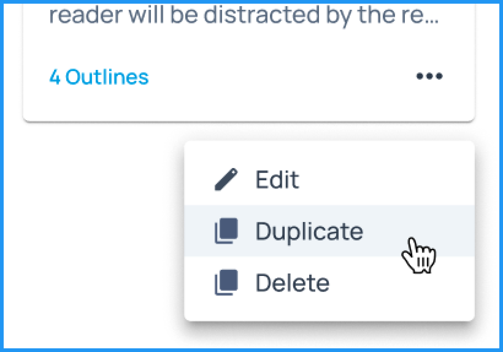
FIGURE: CRUD Functions
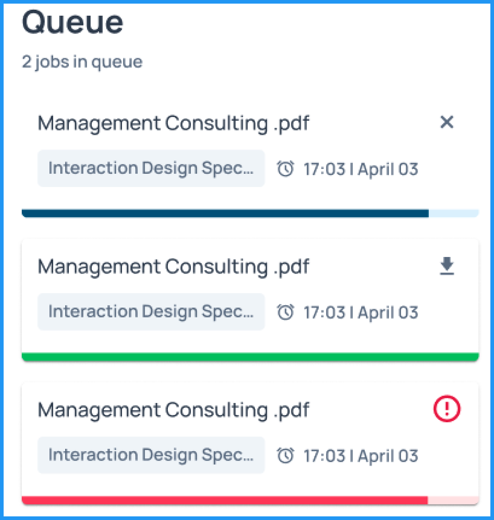
FIGURE: Queue Section
The queue panel displays all the generated files of all the projects from the project library.This gives Adam an overview of the files that are already generated and the ones that are in progress.
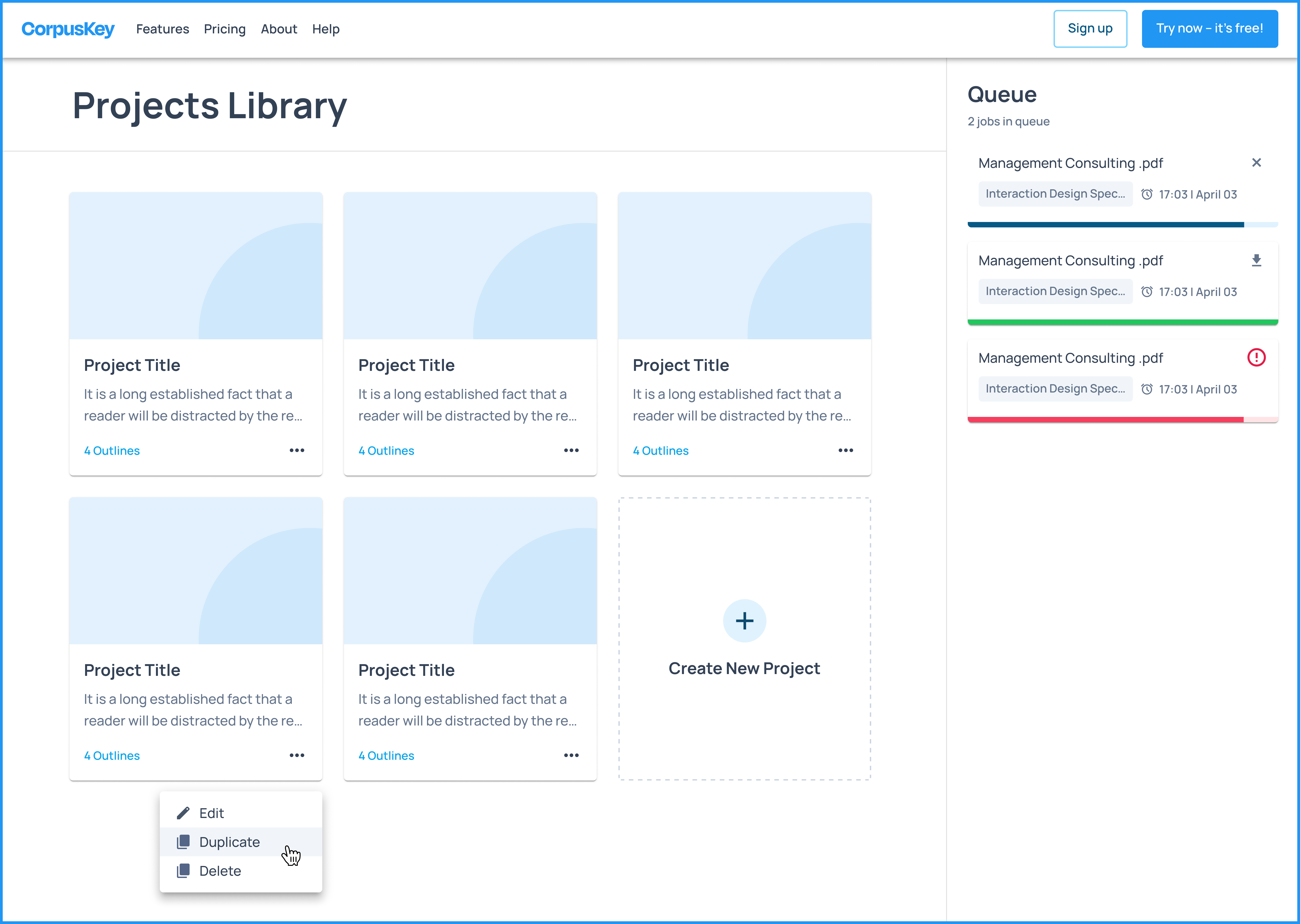
FIGURE: Project Library Page Screen
B. Project Creation Model
When Adam decides to start a new project, he's directed to a page where he can input the project's name and optionally add a description. From there, he's guided to the Project Dashboard, where he can get a summary of his project.
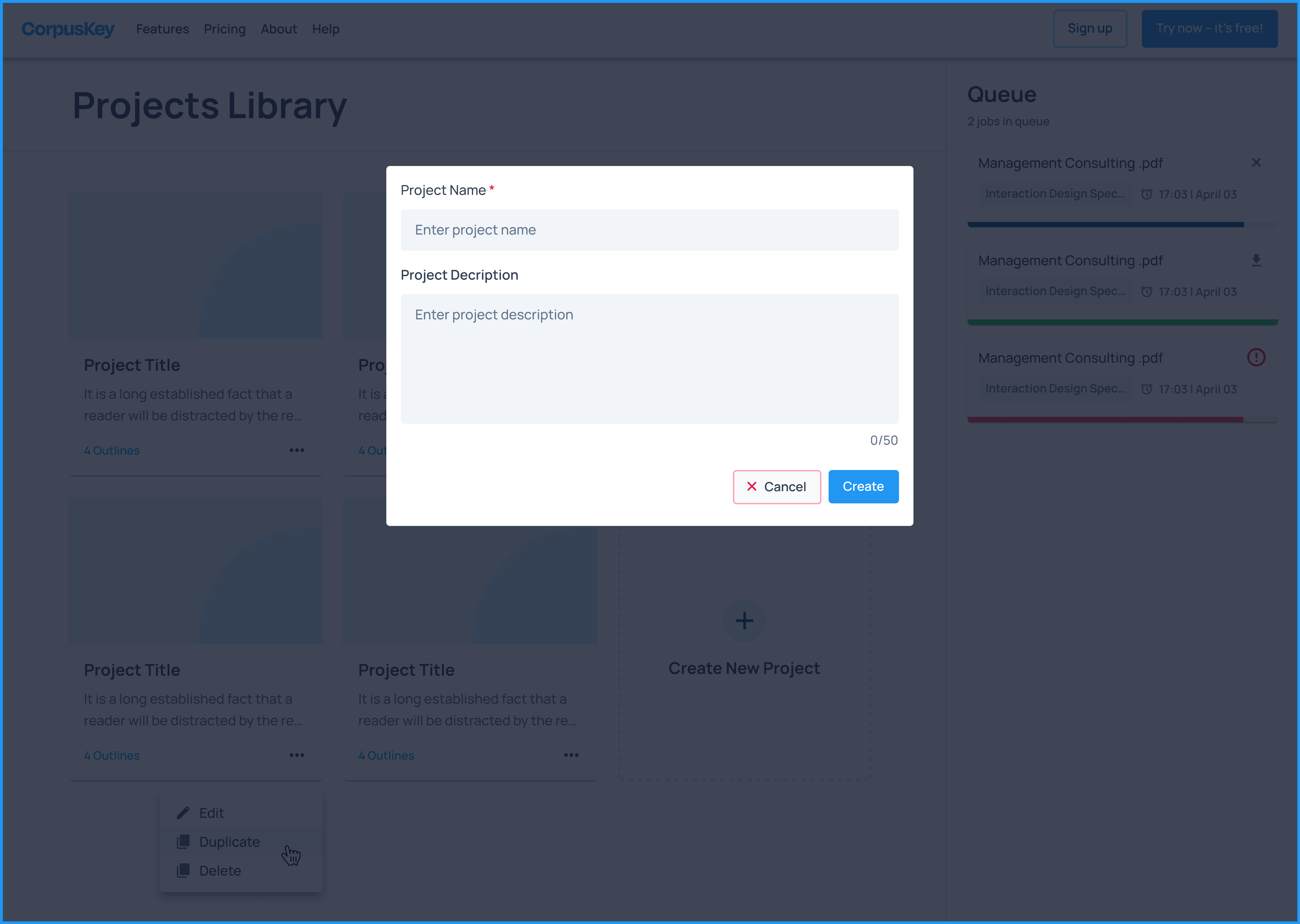
FIGURE: Project Creation Model Screen
C. Project Dashboard
Adam is taken to this page after creating a project from the previous screen.
This is the main page that gives him an overview of the project which includes three main sections :
● Upload files section: This section is for Adam to upload files which he will use for content generation based on the prompt he gives in the next section for outline generation
● Outline generation section: This section shows him the list of outlines that have already been created. If Adam wishes to create a new outline using a fresh prompt he can click on the “Create New Outline” button. This button navigates to the next screen. This section also allows Adam to select the file type he wishes to generate, i.e, docx, ppt, etc.
● Queue: This queue represents the list of the outlines that are in progress of being generated and the ones that are already generated. Adam can see the status of all the outlines for that respective project by clicking on each project tile from the project library page.
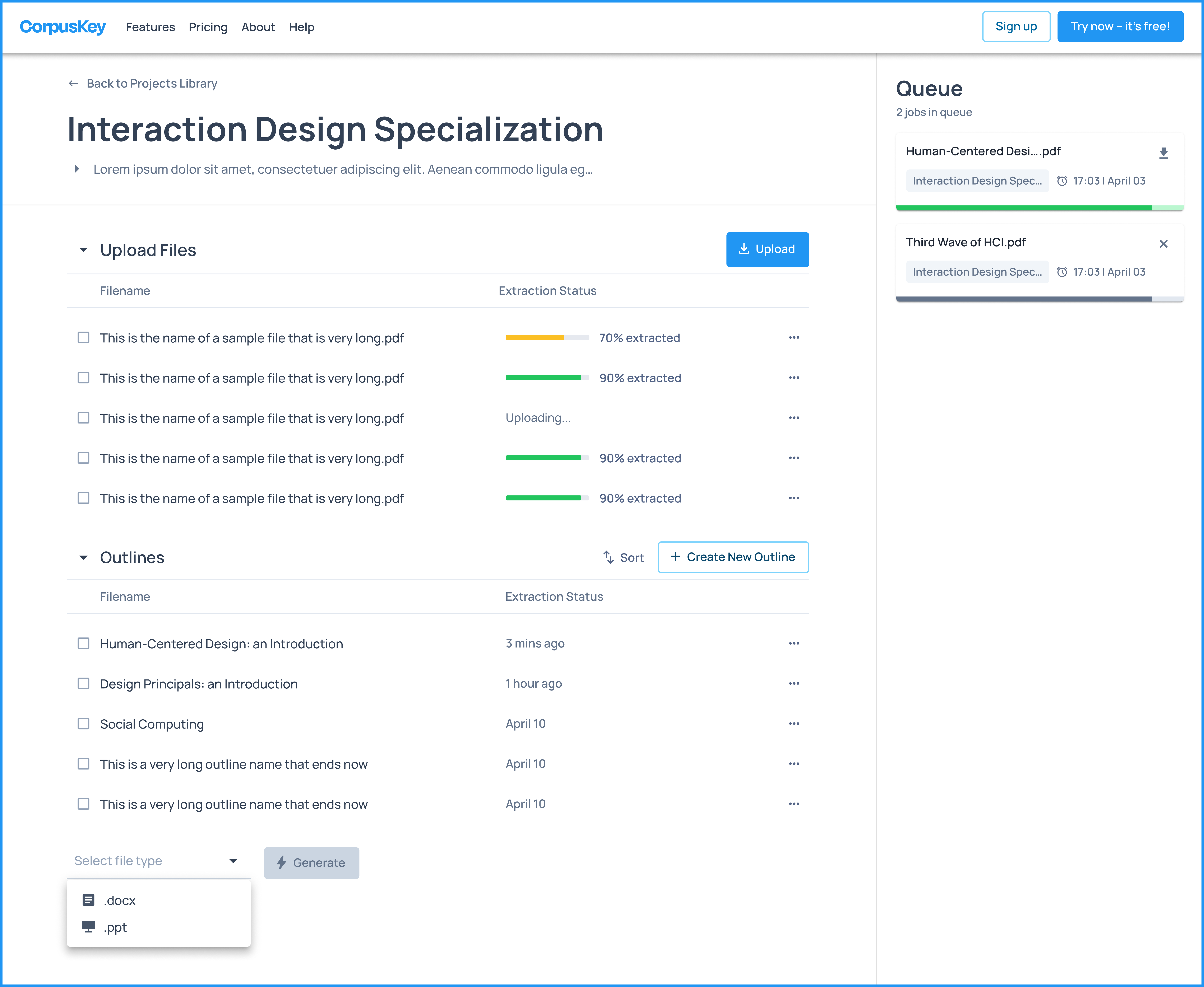
FIGURE: Project Dashboard Screen
D. Outline Management Page
After clicking on the "Create New Outline" button, Adam is directed to the outline management page. Here, he can create a structured outline with different headings and subheadings for the content he plans to generate for his class. The page provides Adam with a nested container for each heading, allowing him to enter prompts or learning objectives for each level.
If Adam is new to the platform, he can hover over the "?" icon next to the "Learning Objective" and "Reference" boxes to learn more about them.

FIGURE: Helper Text
The "+ Add item" feature allows Adam to add multiple subheadings to a single heading or create multiple headings for his outline.
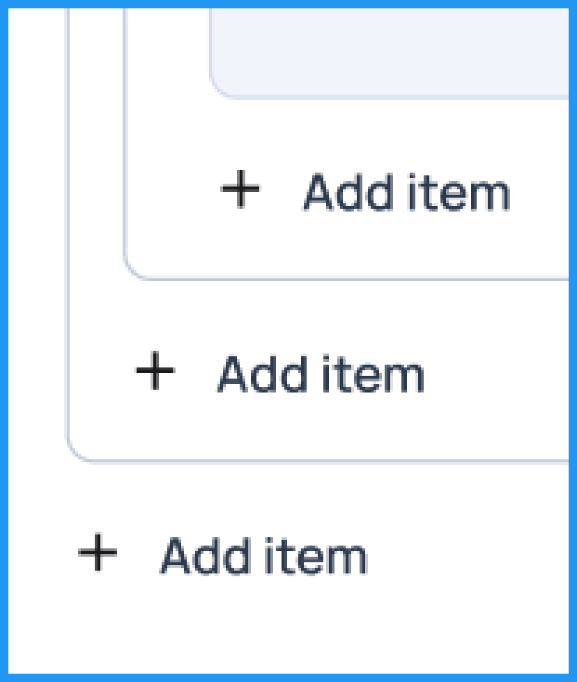
FIGURE: Add Item
To ensure the best content output, Adam will provide clear instructions in the learning objectives section. Once he's satisfied with his objectives, he clicks the "Create" button. After completing the outline, Adam can proceed to generate the content. In the queue panel, he can track the progress of his outline as it's being generated or check if it's already done and ready for download.
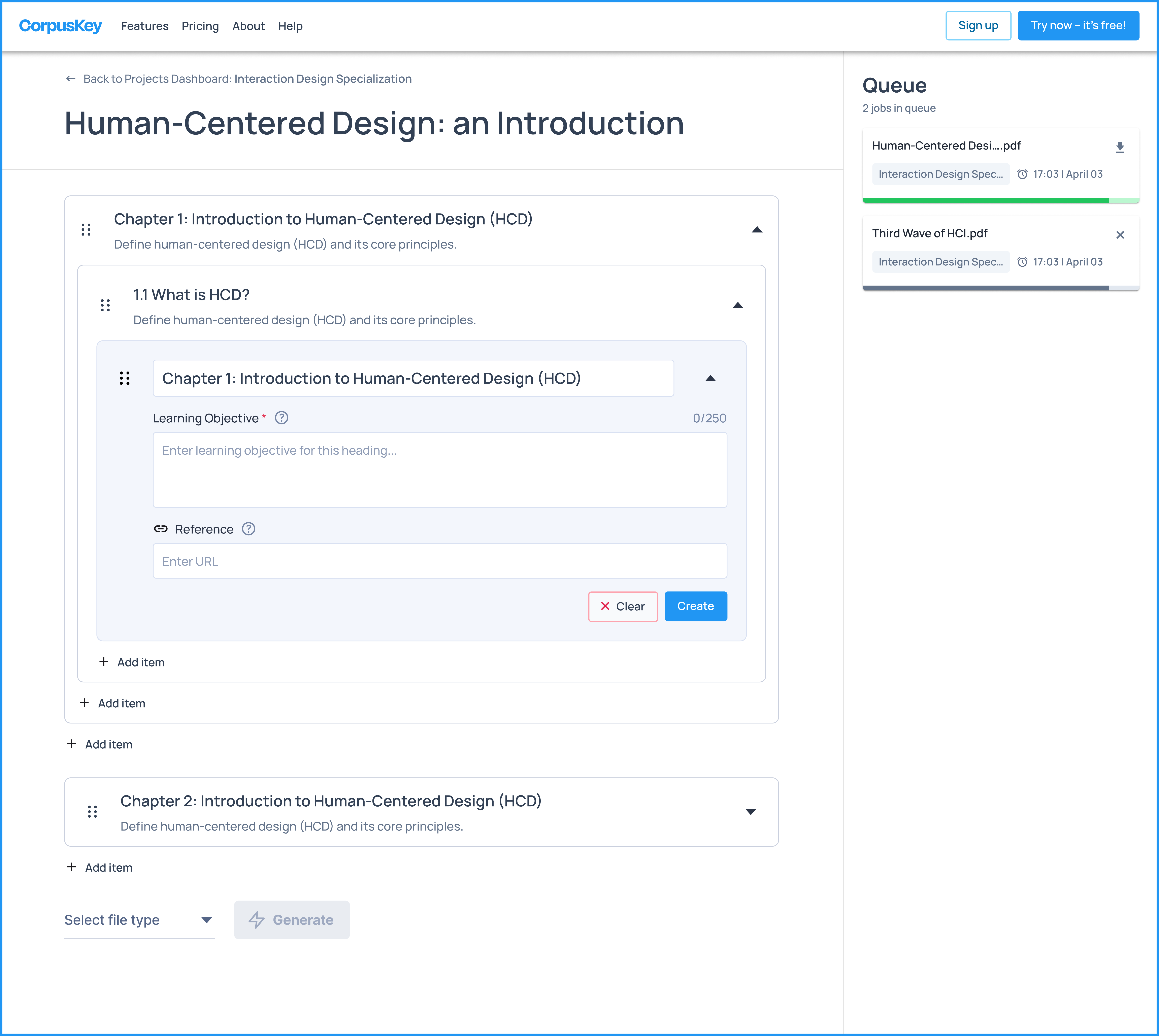
FIGURE: Outline Management Page Screen
04 Next Steps
What's Next
Holistic Evaluation: Understanding User Base
Looking forward, it’s important for CorpusKey to examine their consumers closely. From our primary and secondary research, it appears that CorpusKey is targeting a very niche group. The target group of professors and academics vary by teaching styles and disciplines. Computer science professors may not operate or generate content the same way liberal arts professors may. CorpusKey’s model is geared specifically towards consumers who:
(1) Need new or updated course materials regularly. CorpusKey target’s disciplines where class readings have to be updated regularly, with current news or relevant literature frequently updating. Otherwise, users may simply generate content once and use it for future work or simply dismiss the service to use existing work available.
(2) Are familiar with AI & content generation practices. Current CorpusKey model is entirely reliant upon the user regenerating content until their desired outcome is outputted. Additionally, they must get used to modifying prompts in the outline until the output generates acceptable material. This means the consumer model must have some semblance of digital, tech, and artificial intelligence literacy—which not all professors and academics may be familiar with.
KEY TAKEAWAYS
This project was my first experience working with a corporate company, and I gained a lot from it. Throughout the project, I was able to engage in a variety of tasks that pushed me beyond my previous experience, particularly in the area of testing. I performed numerous types of tests that I had never done before, and each of these testing methods offered me new perspectives and valuable insights that helped shape and refine the final design. The knowledge gained from these tests has significantly influenced the direction of the project, allowing me to approach design challenges with a clearer understanding of what works and what doesn’t. This hands-on testing approach allowed me to evaluate the usability of my work in real time, which was crucial in making sure the final product was not only functional but also user-friendly. Each round of testing helped me to understand better how users interact with the design, ultimately leading to a more refined and effective solution. Additionally, this project marked the first time I’ve had the chance to collaborate with a developer. Working alongside a developer who frequently updated the website provided me with immediate feedback, which was immensely helpful in ensuring that the designs I was creating were both intuitive and easy to use. This constant feedback loop allowed for quick adjustments, ensuring that the user experience was as seamless as possible. The collaboration highlighted the importance of teamwork and communication in creating a cohesive, user-centric design. Overall, this project has been a major learning experience for me, both in terms of technical skills and collaborative work.


